Banking that actually makes sense
Client
Klara
Year
2026
Klara is a concept redesign of digital retail banking in Kosovo, built around one real gap: Raiffeisen Bank Kosovo and similar local banks still require branch visits for tasks that should be entirely online. I designed a full digital-first alternative — landing, loan application, and onboarding — grounded in research into one specific user’s frustration with that process.
Scope of Work


Designed for Digital-First Banking
A concept redesign for digital retail banking, built to remove the branch visit from everyday banking tasks. From account opening to lending, every screen is designed around one principle: nothing should require a phone call or a trip to find out.


Designing around one person's actual frustration
Elira K., 32, a marketing specialist in Prishtina, wanted to open a savings account and apply for a small loan. Her bank required in-person visits for both, costing her a full workday. The empathy map revealed that her real frustration wasn’t the process itself, but the ambiguity around requirements, documents, and application status.

Finding the friction, then mapping the fix
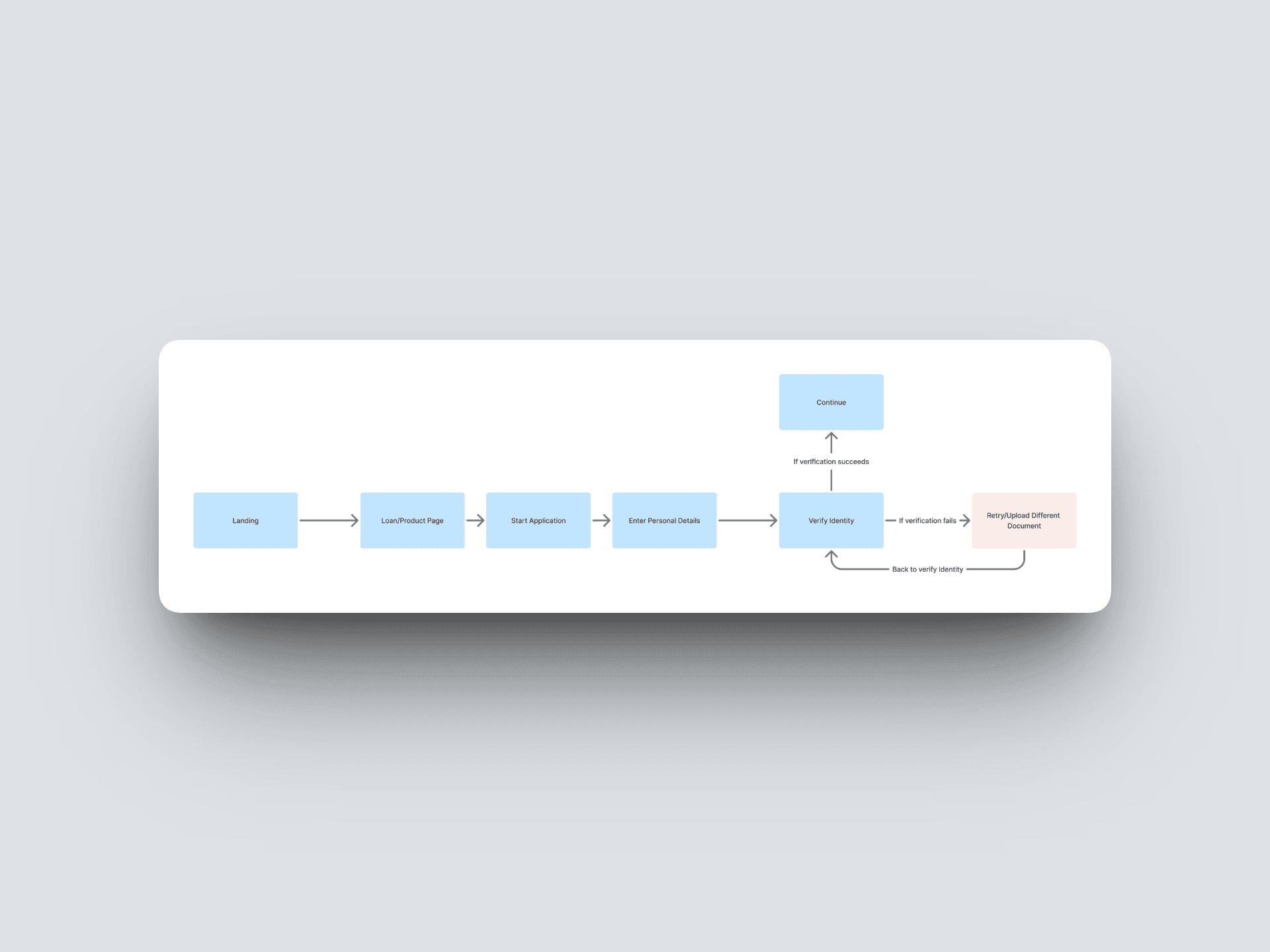
Mapping her journey from Landing → Explore → Compare → Convert → Regular use revealed three key emotional low points: skepticism, price uncertainty, and data-security anxiety. Each became a specific design target. The onboarding flow was also mapped upfront, including identity-verification failure and retry scenarios, so error states could be handled naturally in the final UI.


Structure first, styling second
Before any colour, type, or imagery was applied, each core screen was blocked out at wireframe level — landing, loan application, and the three-step onboarding — to test layout and information hierarchy on their own. This is what let the later visual pass focus purely on tone and trust, rather than also solving structure at the same time.

A design system built for restraint, not decoration
The visual language was built to feel calm rather than flashy — a broad colour system and typographic scale defined upfront so every screen draws from the same set of decisions instead of improvising. Visual inspiration was pulled from Dribbble, Behance, Mobbin, and Awwards, alongside close study of Raiffeisen's own site.


Building Trust Throughout the Experience
Trust, transparency, and confidence were built into every key interaction — from clear trust signals on the landing page and upfront loan costs to a guided onboarding flow with progress indicators, security reassurance, and a final editable confirmation before submission.

Nothing gets submitted without a final, editable summary
The last step restates every field the user entered before the account opens, with a clear way to go back and change anything. No surprises at the finish line.
